
Images Don't Slow Websites Down. How You Add Them Does.
The average web page is now over 2.5 megabytes. Images account for roughly half of that weight. That is not a design problem. It is an engineering problem. And most businesses do not even know they have it.
Images are the heaviest thing on your website
According to the HTTP Archive, the median web page in 2025 weighs over 2.5 megabytes. Images account for roughly half of that total. On some sites, particularly in ecommerce, hospitality, and property, images make up 70 percent or more of the page weight.
That weight has real consequences. On a typical 4G mobile connection, a 3MB page takes over four seconds to load. Google's own research found that 53 percent of mobile visitors abandon a site that takes longer than three seconds. Every additional 100 milliseconds of load time reduces conversion rates by an average of 1.11 percent, according to Akamai.
For most businesses, images are the single biggest performance bottleneck. Not JavaScript. Not CSS. Not server response time. Images. And the problem is almost entirely solvable.
Why images matter so much
You cannot simply remove images and call the problem solved. Images are not decoration. They are one of the most powerful tools you have for converting visitors into customers.
The human brain processes visual information 60,000 times faster than text. Research from MIT found that people can identify images seen for as little as 13 milliseconds. No headline, no matter how well written, communicates as quickly as a photograph.
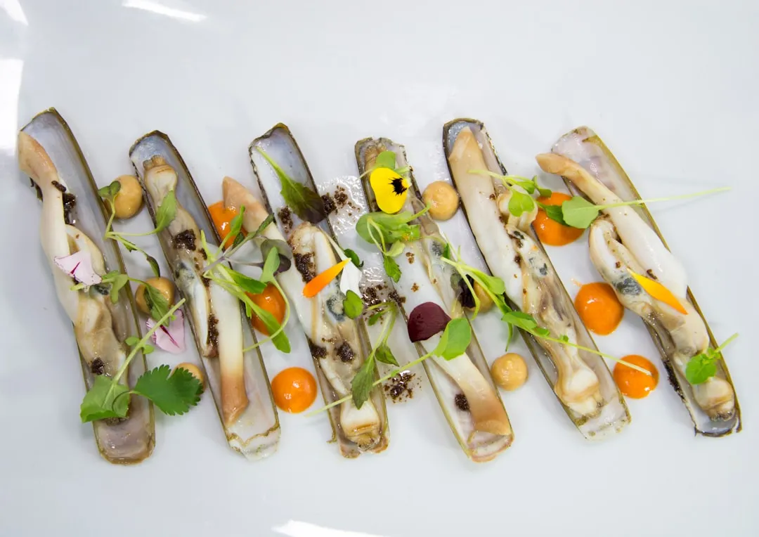
Think about the businesses that live and die by their imagery. A restaurant without food photography is asking you to imagine what the food looks like. An estate agent without property photos is asking you to take their word for it. A hotel without room images is asking you to book blind. A fashion retailer without product shots simply does not exist online.
Research from Justuno found that 93 percent of consumers consider visual appearance to be the key deciding factor in a purchase. When Etsy tested image quality against other listing factors, professional-quality photos correlated with a 40 percent increase in conversion rate.
The paradox is clear. Images are essential for conversion but destructive for performance if handled badly. The answer is not fewer images. It is better images.
JPEG, PNG, WebP, AVIF: which format actually matters
JPEG has been the default image format on the web since 1992. It does a reasonable job compressing photographs, but it was designed for a world where a 14.4 kbps modem was fast. We can do better.
PNG is lossless, meaning it preserves every pixel exactly. That makes it ideal for graphics with sharp edges, text, logos, and icons. It is terrible for photographs. A photo saved as PNG can be five to ten times larger than the same image as JPEG, with no visible quality difference to the human eye.
WebP, developed by Google, reduces file sizes by 25 to 35 percent compared to JPEG at equivalent quality. Every modern browser supports it. Safari added support in 2020. There is no reason to serve JPEG to any browser in 2026.
AVIF is newer and more aggressive. Developed from the AV1 video codec, AVIF can reduce file sizes by 50 percent or more compared to JPEG. Browser support is now widespread. Chrome, Firefox, Safari, and Edge all support it. AVIF handles photographs, illustrations, and even images with transparency.
The single most impactful thing you can do for image performance is switch from JPEG to WebP or AVIF. On a page with 20 images, that switch alone can save 500KB to 1MB of page weight. That is the difference between a two-second load and a four-second load on mobile.
Responsive images: stop sending desktop photos to phones
Your desktop monitor is probably 1920 pixels wide, maybe wider. Your phone screen is 375 pixels wide. If you serve the same 1920px image to both devices, the phone is downloading five times more data than it needs. The browser has to download the full image, then shrink it down to fit the screen. All that extra data is wasted bandwidth.
The HTML solution is the srcset attribute combined with the sizes attribute. These tell the browser what image widths are available and how wide the image will be displayed at each breakpoint. The browser then picks the smallest image that covers the display area, accounting for pixel density.
In practice, a 1200px hero image that weighs 200KB on desktop might need to be only 400px on mobile, weighing just 40KB. That is an 80 percent reduction in data for mobile users, who are the majority of your traffic and the most sensitive to load times.
Modern frameworks handle this automatically. You provide the source image and the framework generates multiple sizes, outputs the correct HTML attributes, and lets the browser choose the optimal version. There is no manual resizing involved.
Lazy loading: do not load what nobody sees
When a browser loads a web page, it traditionally downloads every image on the page immediately, even images that are thousands of pixels below the fold. On a page with 30 images, the browser might download 25 of them before the visitor has scrolled at all. Those 25 images slow down the initial page load for content the visitor may never see.
Lazy loading solves this. With a single HTML attribute, loading="lazy", the browser delays downloading an image until the visitor scrolls near it. The initial page load only includes images that are actually visible on screen.
There is one important exception. The first image visible on the page, typically a hero image or logo, should not be lazy loaded. This image is part of the initial viewport and contributes to your Largest Contentful Paint score. Lazy loading it would delay it, hurting your performance metrics. Everything else below the fold should be lazy loaded.
The performance impact is dramatic. On a page with 50 images, lazy loading can reduce the initial page weight from several megabytes to a few hundred kilobytes. The visitor sees the page load instantly, and images fill in seamlessly as they scroll.
Width, height, and layout shift
You have probably visited a page where you start reading a paragraph and suddenly the text jumps down because an image above it finished loading. That is Cumulative Layout Shift, or CLS, and Google considers it one of three Core Web Vitals that directly affect your search ranking.
The fix is simple but widely ignored: always specify the width and height attributes on your images. When the browser knows the dimensions in advance, it reserves the correct amount of space in the layout before the image loads. No shift. No jump. No frustrated users losing their place.
If you are using CSS to make images responsive, adding width and height on the HTML element combined with width: 100% and height: auto in CSS will do the right thing. The browser uses the attributes to calculate the aspect ratio, reserves the space, and then fills it with the responsive image. Zero layout shift, every time.
Modern image components in frameworks like Astro, Next.js, and Nuxt handle this automatically by reading the image dimensions at build time and embedding them in the HTML. There is no excuse for missing dimensions in 2026.
Alt text: the description most businesses skip
Every image on your website should have an alt attribute that describes what the image shows. This is not optional. It is required for three reasons, each one more important than the last.
First, accessibility. Screen readers used by visually impaired visitors rely entirely on alt text to communicate image content. An image without alt text is invisible to these users. In the UK, approximately 2 million people live with sight loss. Your images should work for all of them.
Second, SEO. Google cannot see images the way humans do. It relies on alt text, surrounding content, and file names to understand what an image contains. Images with descriptive alt text appear in Google Image Search, driving additional organic traffic. Google's own documentation explicitly states that alt text helps them understand images and improves search relevance.
Third, the legal angle. The Equality Act 2010 requires businesses to make reasonable adjustments for people with disabilities, and recent case law increasingly interprets this to include digital services. Missing alt text is one of the most cited accessibility failures in website audits.
Good alt text describes the content and function of the image. Not "image1.jpg". Not "photo". Not the same generic description on every image. If the image shows a barista pouring latte art, the alt text should say "barista pouring latte art into a ceramic cup". Specific. Descriptive. Useful.
The mistakes we see every week
We audit websites regularly, and the same image problems appear on almost every one. These are not edge cases. They are the norm.
- Uploading raw camera photos at 5MB each, straight from a phone or DSLR, with no compression or resizing
- Using PNG format for photographs, resulting in files three to ten times larger than necessary
- No lazy loading at all, so the browser downloads every image on the page before displaying anything
- No width or height attributes, causing the page to jump and shift as images load
- Generic or missing alt text, making images invisible to search engines and screen readers
- Loading a carousel of six to eight full-resolution hero images on the homepage, none of which most visitors will ever see
- Serving the same 2000px image to a 375px phone screen, wasting 80 percent of the download
Now for the confession
This page has 100 images on it. And it probably loads faster than yours does with one.
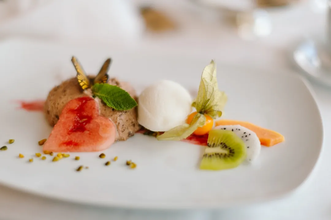
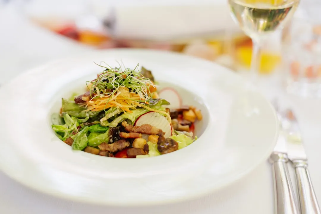
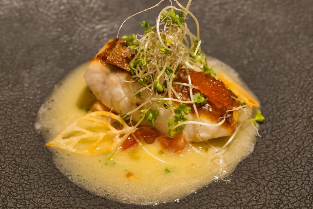
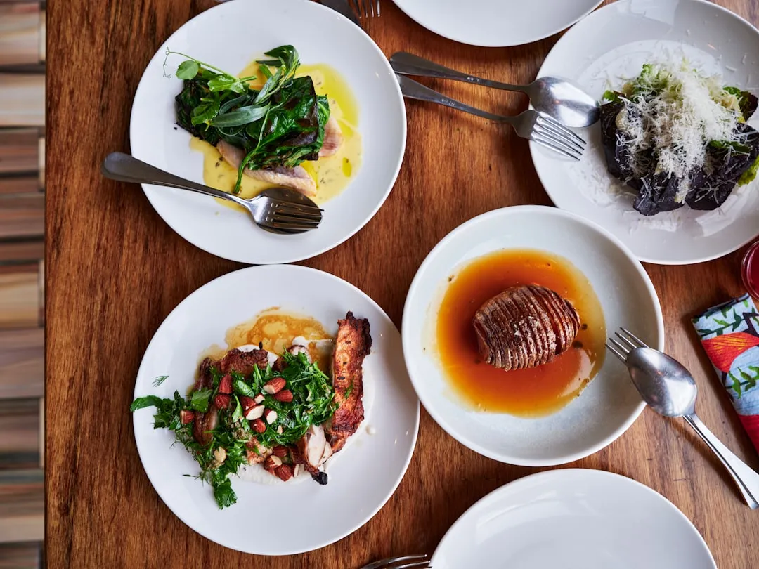
Keep scrolling and you will find every one of them. A hundred photographs in a responsive grid. Food, architecture, products, portraits, landscapes, interiors, technology, craft. The page will not slow down. Nothing will jump. Nothing will lag.
That is what proper image optimisation looks like. Not fewer images. Better images.
Every one of those 100 photographs has been automatically converted to WebP and AVIF, so your browser receives the smallest possible file in the best format it supports. Each image has been generated in multiple sizes, and your browser picks the smallest one that fits your screen. Every image is lazy loaded, so the page only downloads what you can actually see. Every image has its dimensions set in the HTML, so nothing shifts while it loads. And every image has descriptive alt text.
The result is a page with 100 photographs that loads as fast as a page with none. The initial page weight stays under 500 kilobytes because none of the gallery images load until you scroll to them. The Largest Contentful Paint is the heading text, not an image. The Cumulative Layout Shift is zero.
Scroll past them. Then run the PageSpeed test at the bottom. See the score for yourself.
The bottom line
Images are the heaviest part of almost every website. They are also the part most businesses get wrong. Raw camera uploads, outdated formats, no lazy loading, no responsive sizing, no alt text. The result is slow pages, poor search rankings, and lost customers.
The fix is not complicated. Convert to modern formats. Serve responsive sizes. Lazy load anything below the fold. Set dimensions so nothing shifts. Write alt text so everyone and everything can understand your images. Do all five and your site will be faster, rank higher, and convert better.
This page proves it. One hundred photographs, all optimised, all lazy loaded, and the PageSpeed score speaks for itself.
How we can help
Every website we build at Brooks & Grant includes image optimisation as standard. We use modern build tools that automatically convert images to the best format, generate responsive sizes, set dimensions, and apply lazy loading. Your images look sharp, load fast, and work for every visitor on every device.
If your current site is serving uncompressed JPEGs from 2019, uploading 5MB camera photos directly into your CMS, or missing alt text on every image, we can fix that. Image optimisation is one of the highest-impact, lowest-effort improvements you can make to an existing website. It directly improves your PageSpeed score, your search ranking, and your conversion rate.
Whether you need a complete rebuild or just want your existing images sorted out, we are here to help.
Find out what your images are costing you
Images that sell, images that tell
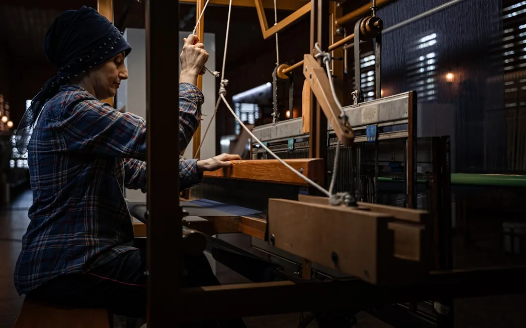
One hundred photographs. Every one optimised, lazy loaded, responsively sized, and described with alt text. Think they only look fast because they are small? Hit the full width button. Scroll past them, then run the PageSpeed test below.











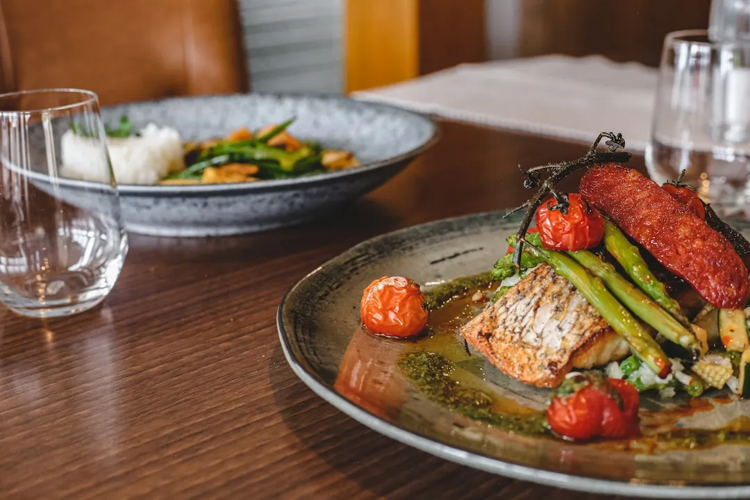
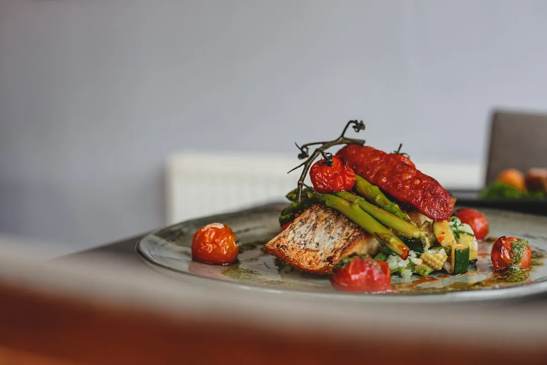
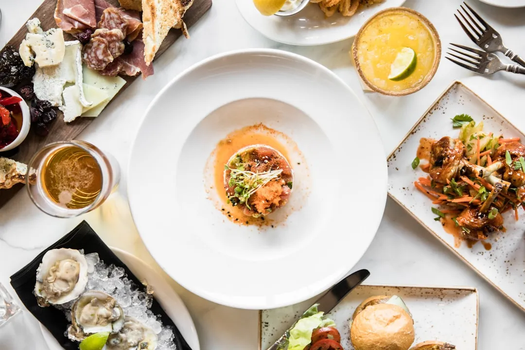
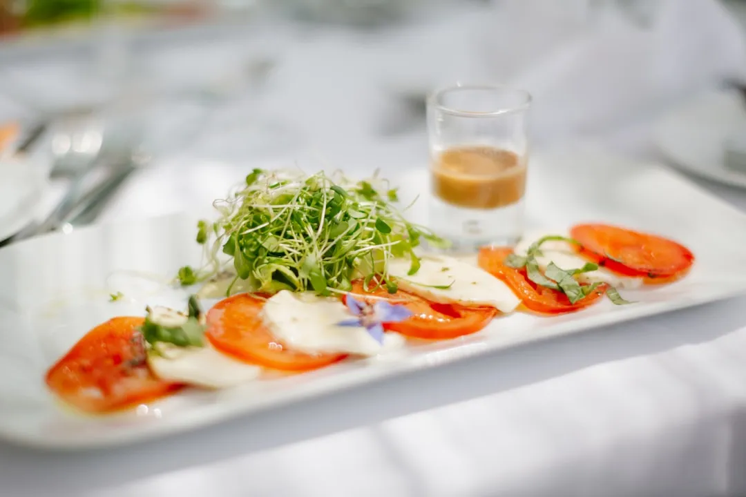

![a [UNK] with a large bed and a tv on the wall](/_astro/hotel-03.cdRprhJY_Z1kKWlB.webp?dpl=dpl_4zEe4NCFPyXqgz38eBNVBAmdiyDx)






















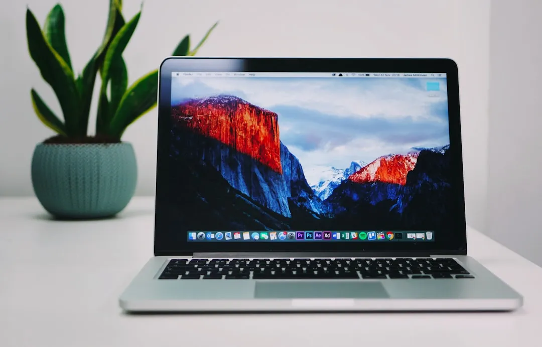




100 photographs. All optimised. All lazy loaded. All with descriptive alt text.
Photographer credits
- Louis Hansel
- Emma Houghton
- Emma Houghton
- Joanie Simon
- Janesca
- Janesca
- Janesca
- hirok yam
- Neon Wang
- Milan Trninic
- Anugrah J
- Matthew Hamilton
- Kurt Francois
- Tory Hoffman
- Rumman Amin
- Aditya Sethia
- Aditya Sethia
- pawan kumar
- Aditya Sethia
- pawan kumar
- Amir Hosseini
- Luke van Zyl
- Peter Ivey-Hansen
- Anatolii Nesterov
- Anders Jildén
- Rashid Hamidov
- Étienne Beauregard-Riverin
- Michael Seh
- Kimon Maritz
- Alex
- Giorgio Trovato
- Compagnons
- Ryan Hoffman
- Darion Dewhirst
- The Connected Narrative
- Vitaly Gariev
- Vitaly Gariev
- Viktor Forgacs
- Paolo Resteghini
- Vitaly Gariev
- Antonio Araujo
- Travis Chen
- Frugal Flyer
- Masato Tsuchiya
- Michael Lock
- Erik Mclean
- Antonio Araujo
- Dynamic Hong Kong
- Dynamic Hong Kong
- Dynamic Hong Kong
- Danielle Cerullo
- Humphrey M
- Jelmer Assink
- Kelly Sikkema
- Luis Reyes
- gina lin
- Sam Moghadam
- Brian Wangenheim
- Frederick Shaw
- ŞULE MAKAROĞLU
- Manuel Silva
- Shivam Baraik
- John Riojas
- Michael Michelovski
- Valery Tenevoy
- Sergei Gussev
- Ladislav Stercell
- MD.IFTEKHARUL AMIN PONY
- Lý Dương
- Red Zeppelin
- Denis Zelenykh
- Armand Khoury
- Zoshua Colah
- Cheung Yin
- Richard Burlton
- Declan Sun
- Jason Zeis
- Declan Sun
- Anna Sullivan
- Farida Tania
- Kari Shea
- Alex Knight
- Domenico Loia
- Lauren Mancke
- Anete Lūsiņa
- James McKinven
- Andrew Neel
- Luca Bravo
- Christopher Gower
- freddie marriage
- Annie Spratt
- Jasmin Schreiber
- ANYA RICHTER
- Annie Spratt
- Shelby Murphy Figueroa
- Kelly Sikkema
- Jordy Muñoz
- LISK OBE
- Yasin Onus
- Yasin Onus
All photographs from Unsplash